Project Timeline
Context
Role
Responibilities
My Six-Month Hotel Booking App Design.
I designed a hotel booking app as part of a six-month practice project at the UX Design Institute. My goal was to create an intuitive and accessible booking experience. Throughout the project, I conducted user research, developed wireframes, and built a functional prototype. This case study highlights the key insights I uncovered and the process I followed to enhance the booking journey.
What’s the Problem?
Your Gateway to Hassle-Free Hotel Reservations.
Despite the widespread use of mobile devices, 75% of users in the United Arab Emirates still prefer booking hotels on a desktop or laptop. Yet, the process often feels unnecessarily complex. In this case study, I share my journey—from initial research to final design—and show how I transformed insights into action to create a smoother, more intuitive booking experience.
My Target Users Are
My Goals
My main goals of the research were:
How?
Combining these methods enables cross-referencing and validation of findings, ensuring a comprehensive and objective understanding of user needs and pain points. For example, insights from usability testing can confirm trends identified in survey data, while affinity diagramming helps synthesize insights from competitive benchmarking and user interviews.

To complete this project, I am following the full UX process.
Research
Analysis
Design
Handover
Research
For me, every project begins with research. It helps establish best practices and design constraints.
Competitive Benchmark
I also tested top hotel booking apps and studied how users perceive things and what patterns are widely used. This helped me identify intuitive features to include and areas that needed improvement features to add versus things that I could improve as well as distinguish myself.
My key Goals:
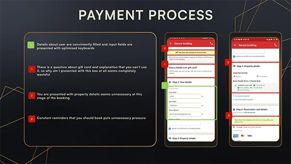
Some Pain Points:
My Key Finding:
Online Survey
Next, I conducted a survey with my target audience to understand what they liked or disliked about existing hotel apps and to identify the information they consider most important.
My key Goals:
Some Pain Points:
My Key Finding:
Usability Test
Before designing, I conducted remote usability tests to observe how users navigate hotel booking apps. By assigning two tasks, I identified pain points and gathered user suggestions to improve the experience.
My key Goals:
Some Pain Points:
My Key Finding:
Synthesize & Analyze The Data
The goal of this method is to organize research data into visual categories, revealing common pain points and desires, and validating research insights through collaboration.
Affinity Diagram
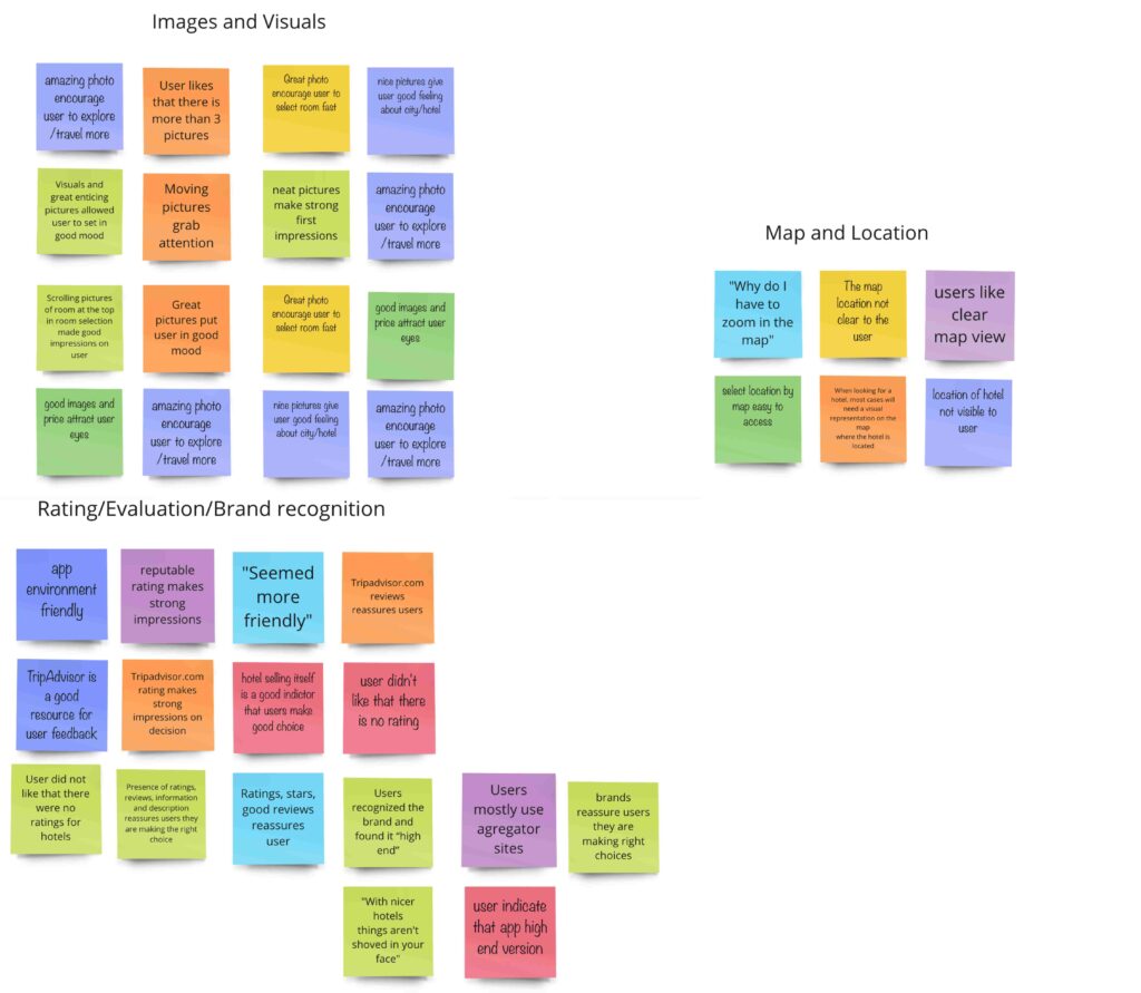
To make sense of the research data—from usability tests, surveys, and competitor analysis—I collaborated with a colleague to create remote affinity diagrams. This helped us organize insights, identify key patterns, and validate findings. Working together gave us a deeper understanding of user needs and pain points.
My key Goals:
Some Pain Points:
My Key Finding:
Customer Journey Map
The purpose of creating a customer journey map is to visualize what users do, think, and feel at each step of the booking process. This helps to find areas to improve and make the user experience better.
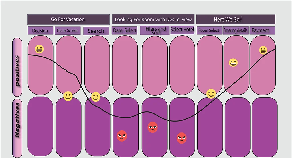
From the affinity diagram, I saw common likes and dislikes among users. Using this information, I created a journey map showing key touchpoints, emotions, and pain points throughout the booking process. This map highlights areas that need improvement and ensures a smoother user experience.
My key Goals:
Some Pain Points:
My Key Finding:
By creating a customer journey map, we gain clear insights into how users interact with the booking app. This helps us pinpoint pain points and uncover opportunities for enhancing the user experience, leading to a more seamless and satisfying journey for our users.
User Flow
The main goal of creating a user flow is to visualize the steps users take when interacting with the booking app. This helps identify their actions, thoughts, and feelings at each stage, revealing areas for improvement.
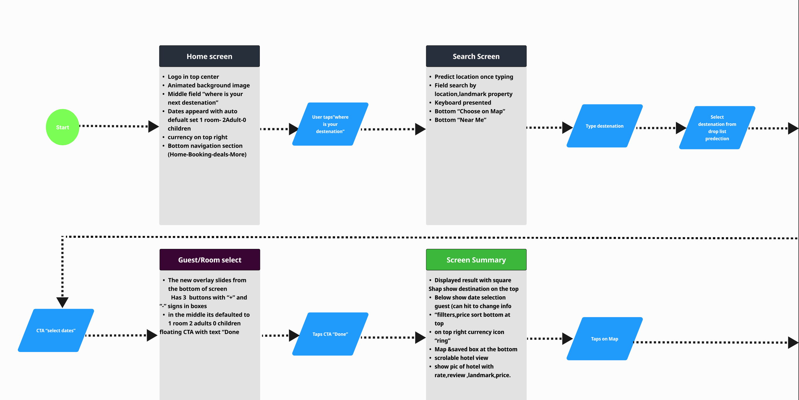
After mapping out the Customer Journey, I had a clear vision of how the hotel booking process should flow and what screens were needed. To bring this vision to life, I created a user flow diagram. This diagram showed each step the user takes, making sure the booking experience is smooth and easy to follow.
My key Goals:
Some Pain Points:
My Key Finding:
Turning Concepts into Designs
Giving life to thoughts.
Sketches
Sketching is a quick way to visualize different design ideas and explore multiple options before moving to digital tools.
Once the flow was clear,I pulled out my pencil and paper and started sketching different concepts. I kept my research in mind, focusing on user preferences. This allowed me to explore different ways to improve the booking experience and make it more enjoyable.
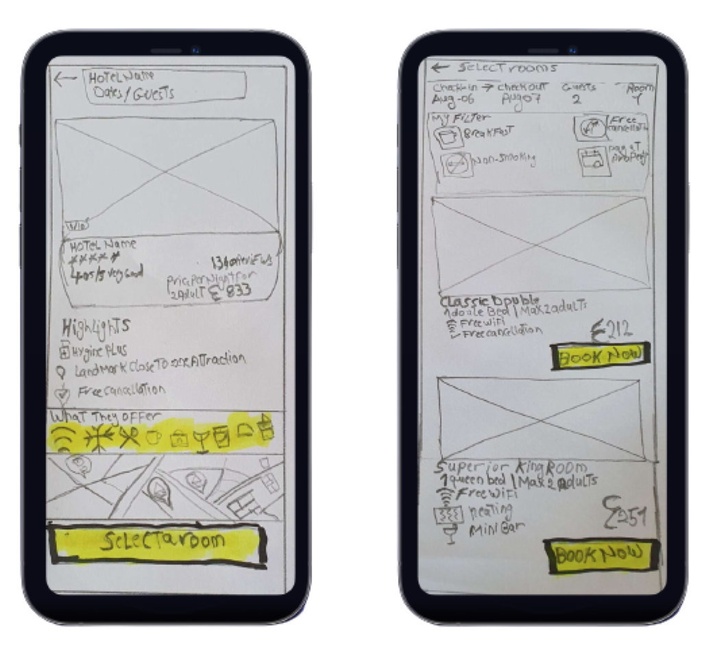
My key Goals:
My Key Finding:
Wireframes
The major goal of a prototype is transforming initial sketches into clickable screens to gather valuable user feedback and refine the design.
After noticing layout issues, I revisited my sketches to refine the design. I used whitespace and layout grids to make sure everything looked neat and organized..

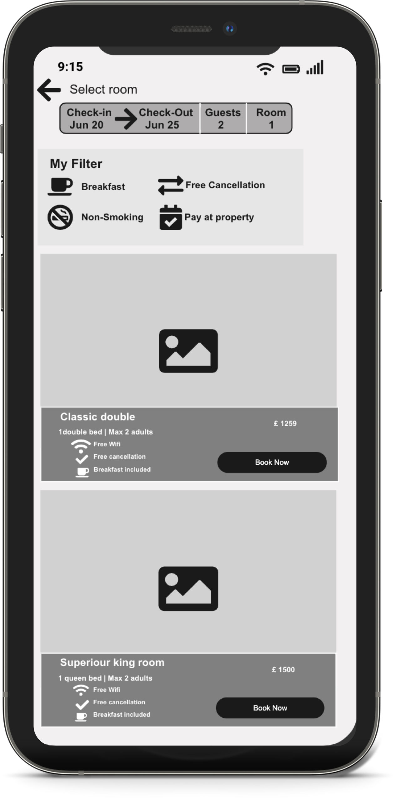
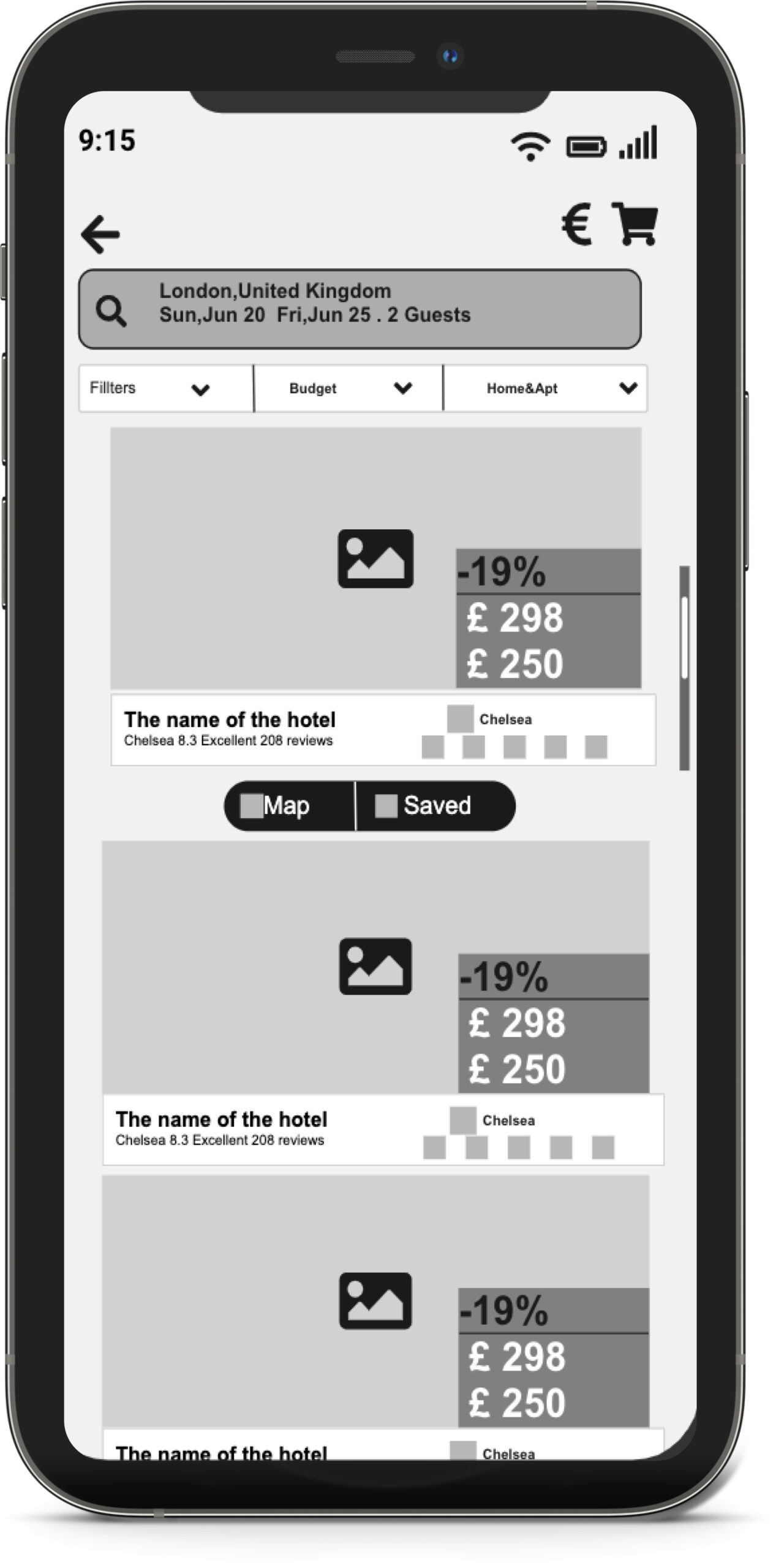

My key Goals:
Some Pain Points:
My Key Finding:
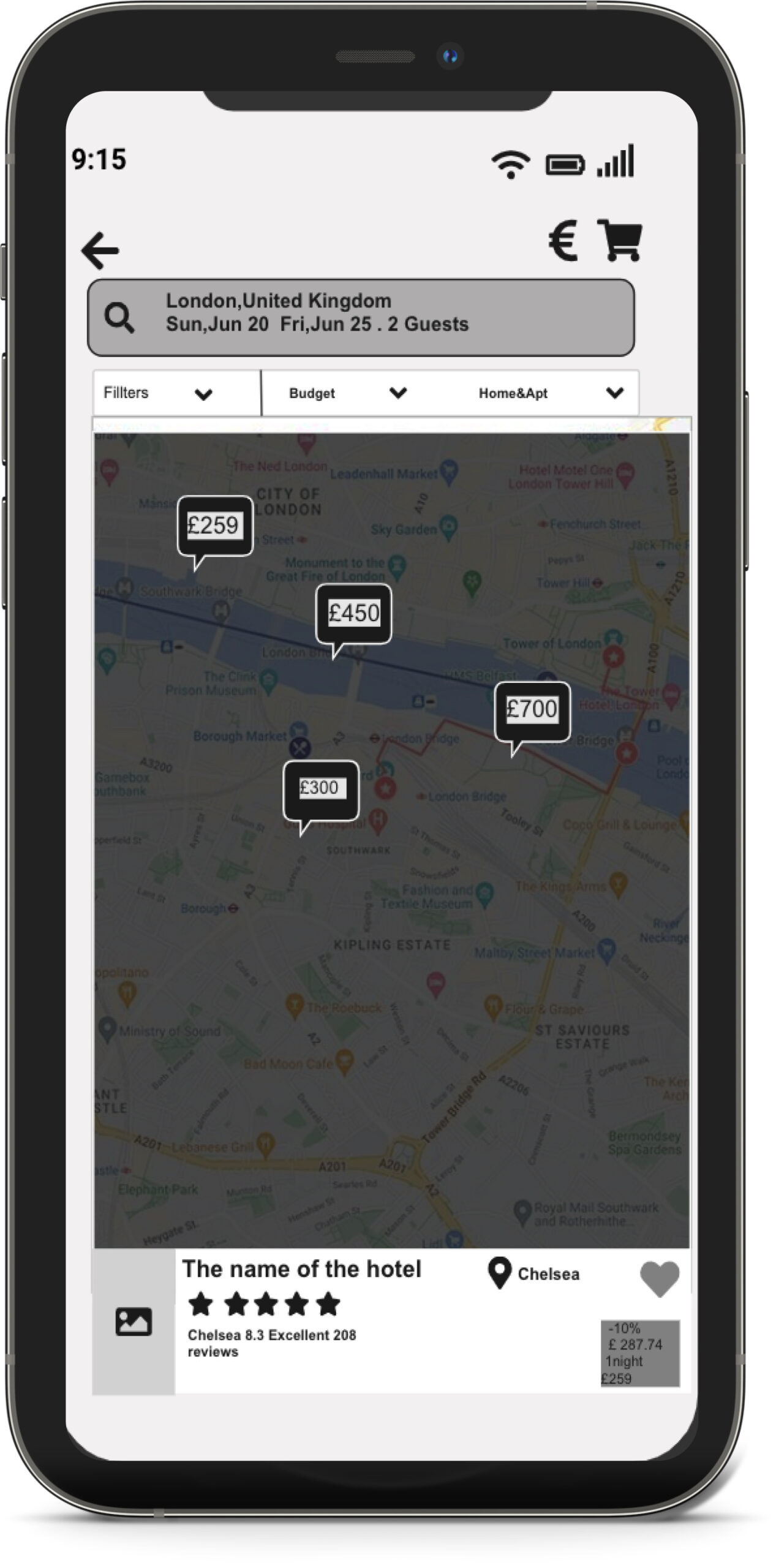
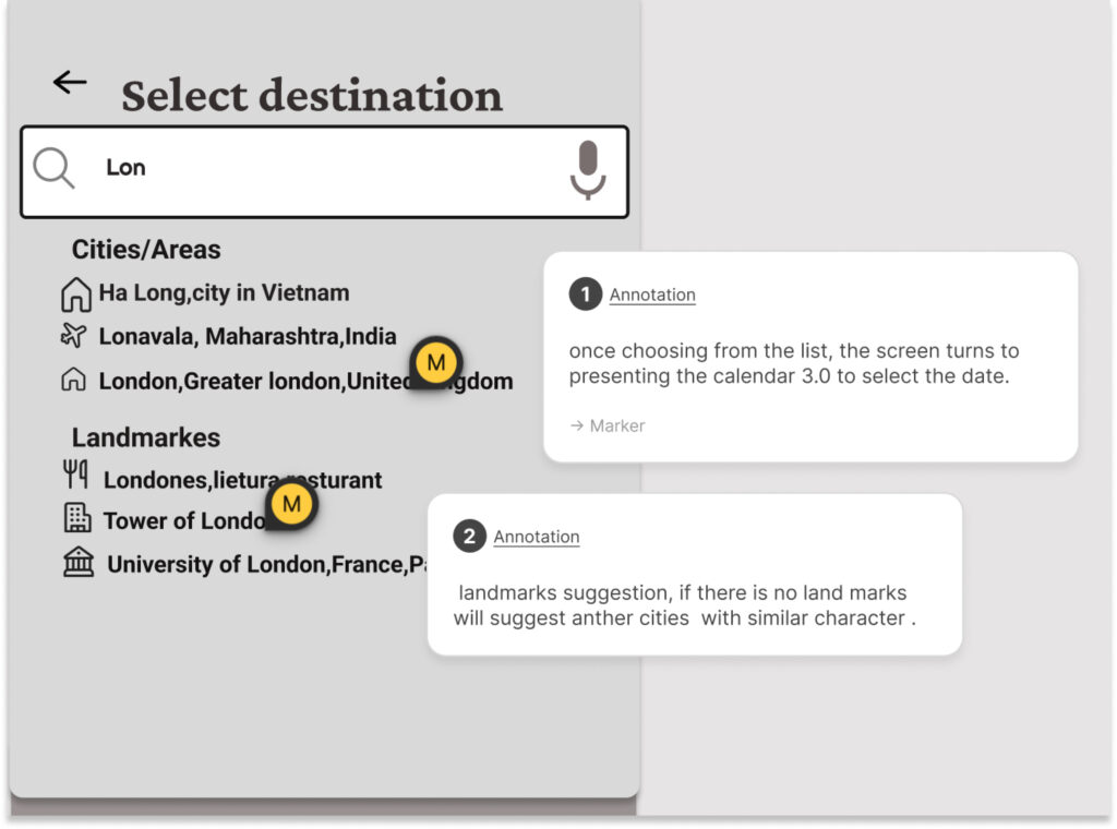
Annotations
The main goal was to create detailed wireframes that developers could easily follow. After validating the prototype, I made wireframes with clear notes for each interaction. These notes included user feedback, helping developers understand exactly what was needed. This made the development process smooth and ensured the final product matched the design.
My key Goals:
Some Pain Points:
My Key Finding:
Interactive Prototype
Main goal was to create a clickable prototype to see how real users interact with the design and identify any issues.
The prototype was the final piece that brought my app to life before launch. Despite some bumps in learning to prototype, it was worth it in the end.
My key Goals:
Some Pain Points:
My Key Finding:
UX Lessons Learned
Working through the entire UX design process for this project was such a valuable journey. It showed how important it is to take each step methodically to create a solid solution. This experience reinforced the belief that great user experience is crucial for business success today. While I’m proud of the final booking flow designs, which aim to make things smoother for users, we also found areas where we can still improve. It’s all about continuous learning and making things better!